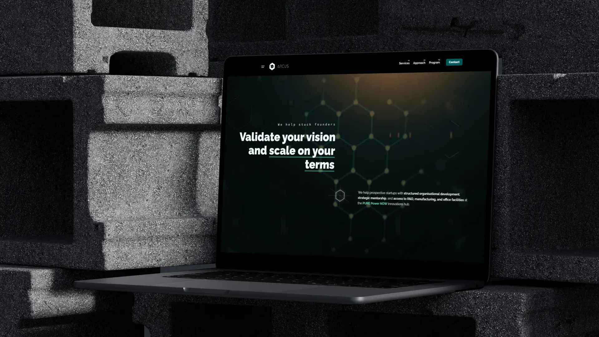
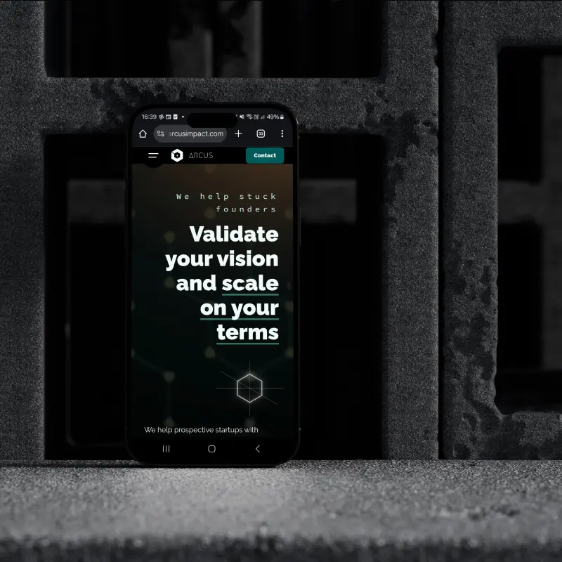
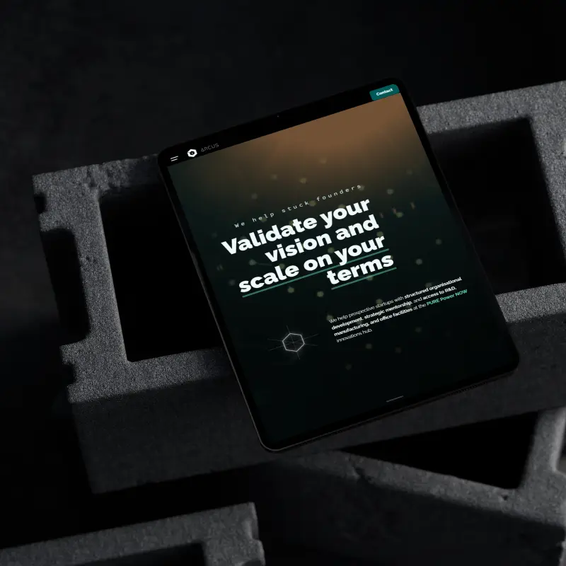
*Live site edits post-delivery may not reflect the original design intent.
Naming the brand Arcus was about strategically anchoring its direction in the Bifröst narrative we established with Pure Power NOW, choosing the Latin term for ‘rainbow’ to solidify its origin roots.
The objective wasn’t to build yet another vanilla accelerator or a one-off consultancy workshop. It was to tame the developmental chaos of growing a biz from startup to steady.
Arcus Impact is about perspective and guidance for the prospective and stuck. A cross-sector intelligence unit, put together by founders for founders. To validate and realize potential..
We designed the Impact Helix framework as both a diagnostic instrument and a developmental tool. Translated it into a 6-step escape route from chaos to growth. Even engraved it into the brand’s core symbol…
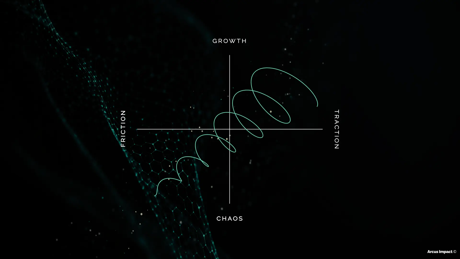
But a map is useless without a guide. So, we made the method into a mentored service platform. From high-level 1:1 diagnostics and group meetups to in-depth bootcamps and sponsored hackathons..
The visual approach remains rooted in Pure’s Bifröst palette, with its own legend in the celestial phenomena mythos.
The Aurora Borealis gradient represents the sub-brand’s autonomy to speak fluent “startup” without the corporate shadow of the parent group.
A distinct identity designed to cultivate deeper collab opportunities within the startup scene.
